The Pundit League
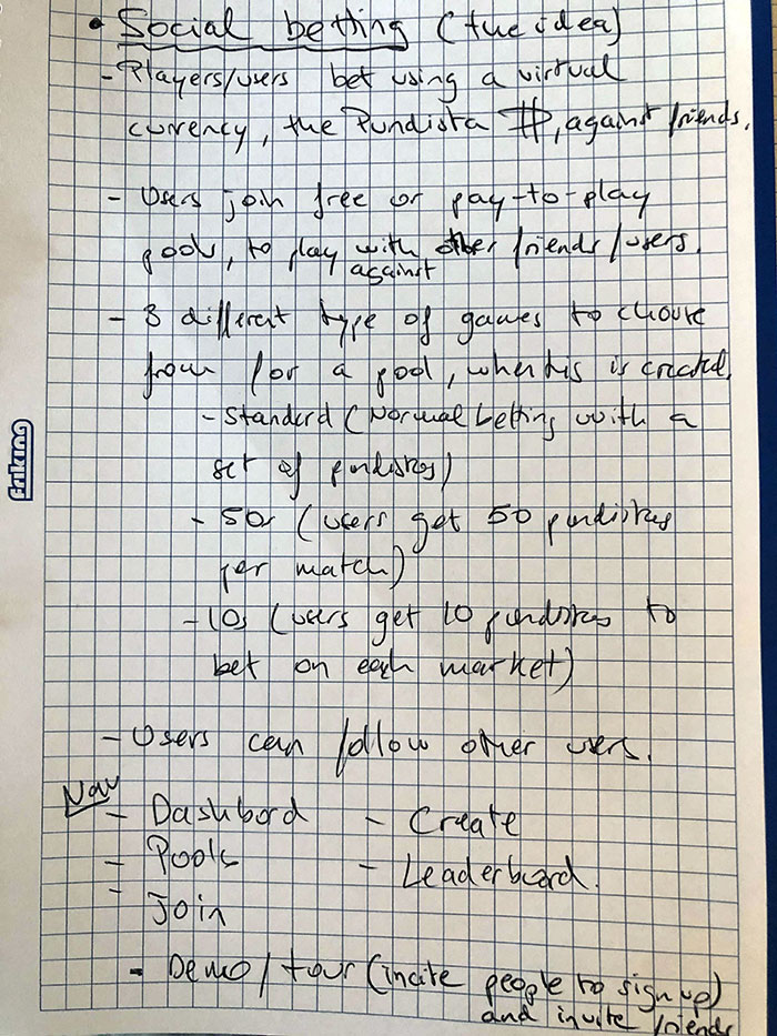
The Pundit League is a social gaming platform offering free and paid pools. Users wager virtual Pundistas on various outcomes, with no per-bet fees. The more bets and Pundistas a user accumulates, the higher their chances of climbing the leaderboard and winning prizes.
Role
Senior UX Designer - 2019
User Research, Interaction, Visual design, Prototyping & Testing.
Tools


Initial Research
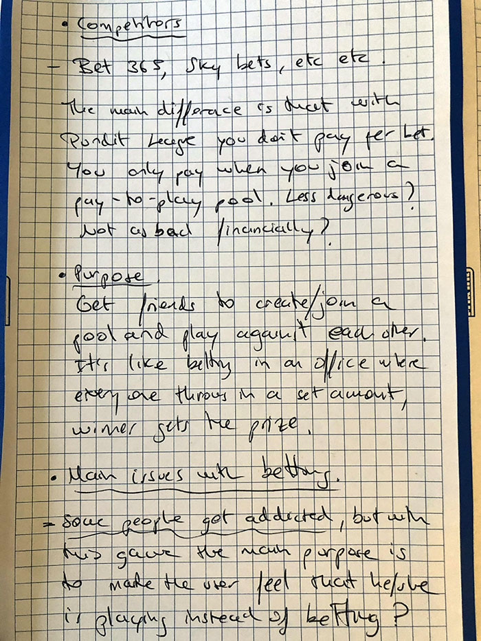
I started by gathering key business requirements and conducting competitor research. To gain firsthand experience, I also signed up for a few betting apps.
Challenge
During my research I found that a lot of people are addicted to gambling. This app aims to provide a fun and social betting experience, allowing users to enjoy friendly competition without the financial risks associated with traditional gambling.
A few reasons why people struggle with gambling:
- Being preoccupied with gambling, such as constantly planning how to get more gambling money.
- Needing to gamble with increasing amounts of money to get the same thrill.
- Trying to control, cut back or stop gambling, without success.
- Feeling restless or irritable when you try to cut down on gambling.
 World gambling statistics show that around 26% of the population gamble. That means around 1.6 billion people worldwide gamble and 4.2 billion gamble at least once every year. Which means, 1/4 of the world actually gambles.
Solution
Get people to spend a lot less money and have fun while using the same betting method.
This could be something similar to trying to cut back on smoking. Some people switch to vaping, and while it is the same habit, the effects have less impact on a person's health.
How can this be achieved?
- Get people to check the app, play the demo and sign up.
- Encourage users to invite friends and family.
- Spread the word so it has a good impact on people that have gambling problems.
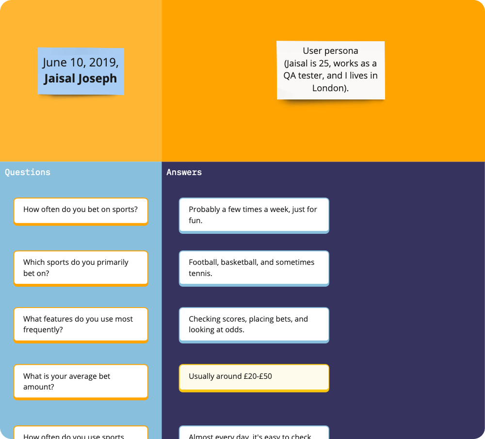
User Interviews preview/example
I conducted several interviews with individuals involved in the betting industry to gain insights into their betting habits and preferences.
Below is a snippet of what an interview looked like:
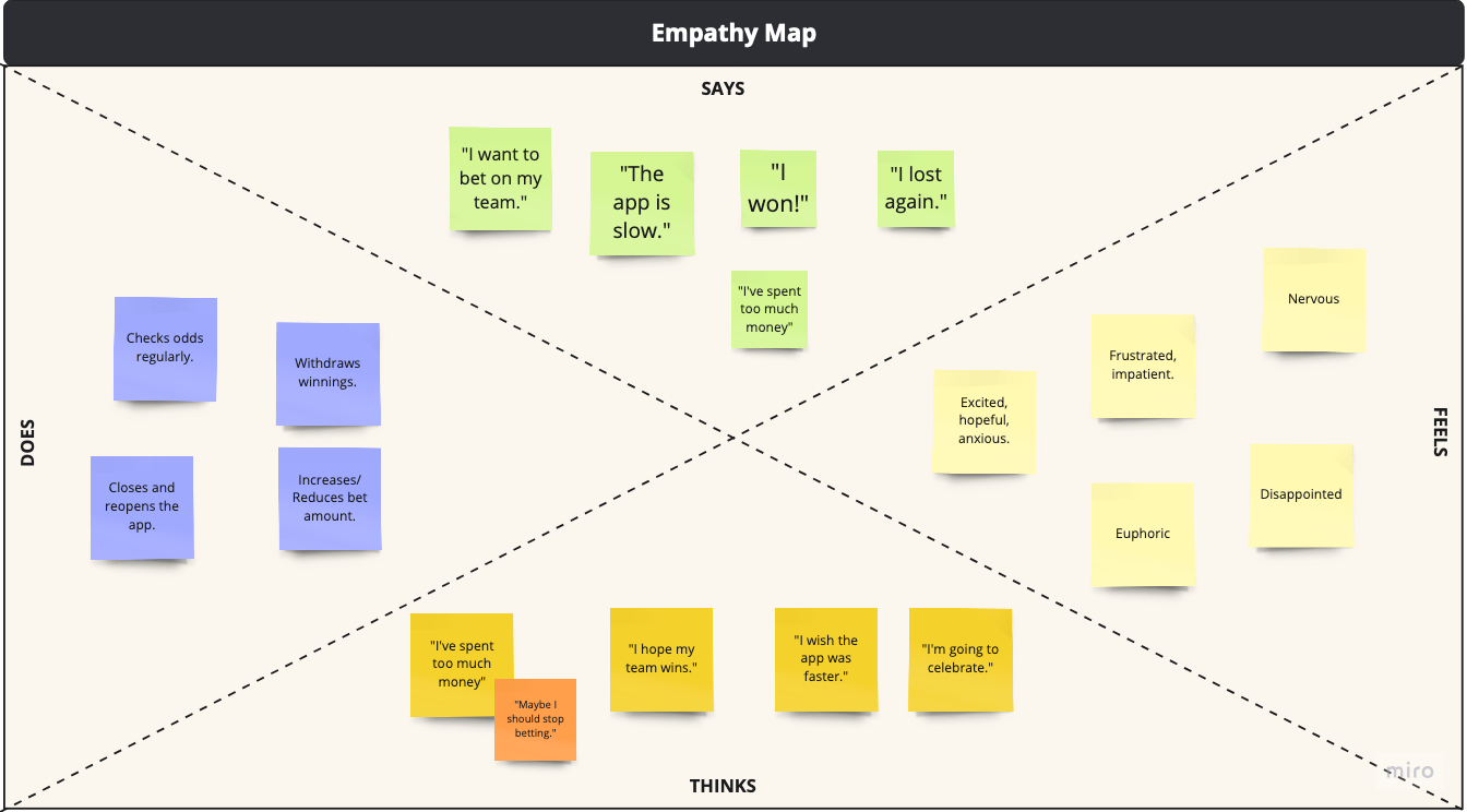
Empathy map
After collating all answers from participants, I put together an empathy map to highlight specific user circumstances and perspectives:
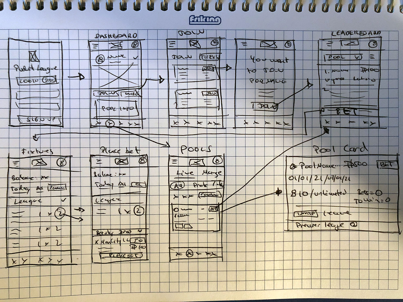
Sketches
Initial sketches after running a few interview sessions and gathering business requirements. This is a big application so iterations happen very often.
For this case study, I've put together the main user journey: from signing up until the user places a bet within a pool he/she has joined. After signing up, the user is re-directed to the dashboard, where the player information and "main" pools are displayed. The "My Pools" page will display all pools the user has joined.
On the dashboard I decided to have a FIXED "Place a Bet" button so the user can place a single bet within a single or multiple pools using a bet wizard (with positive feedback).
Once I had a better idea of the layout I thought would work best, I decided to jump into Balsamiq to create more detailed wireframes before gathering feedback.
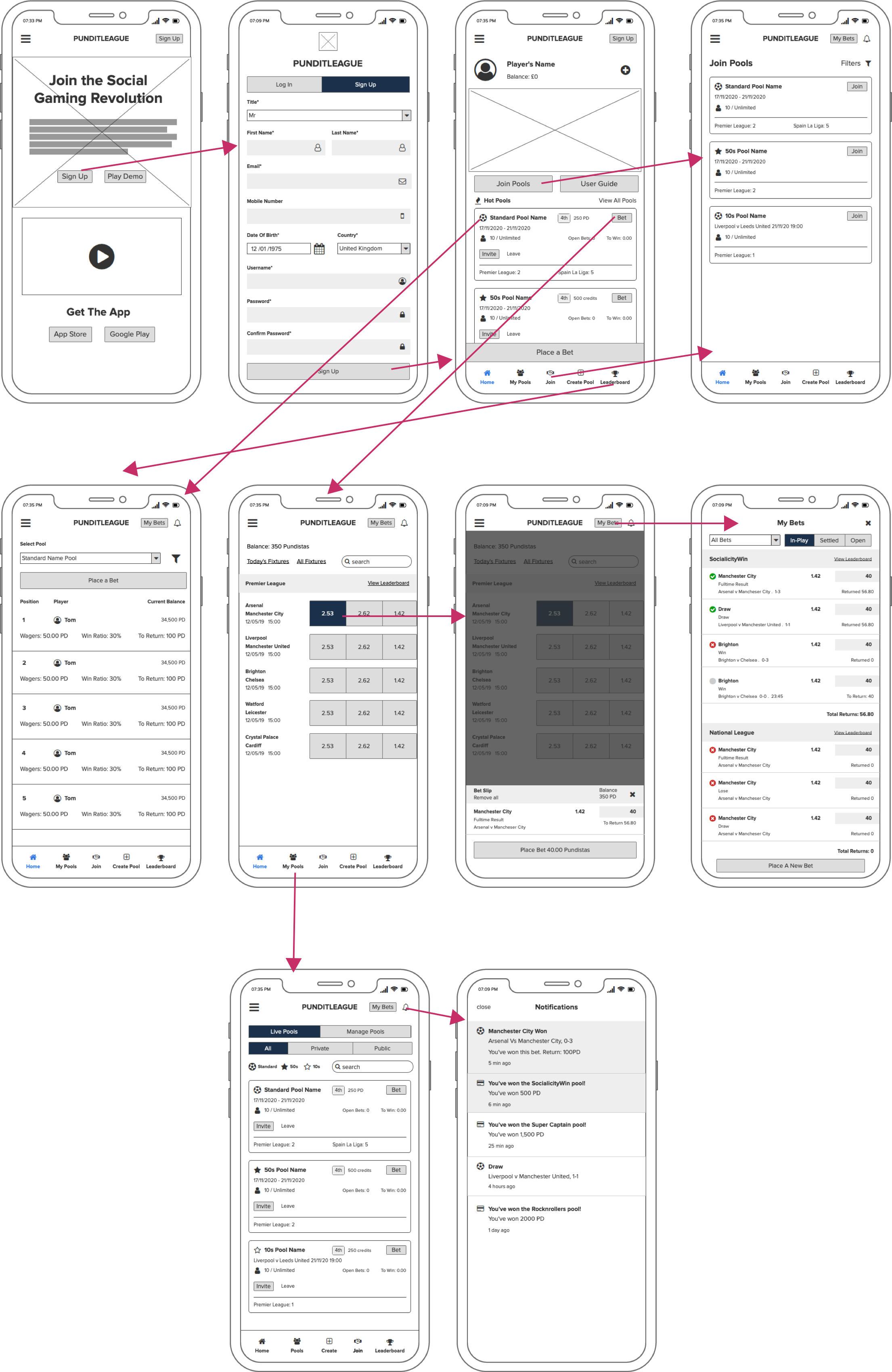
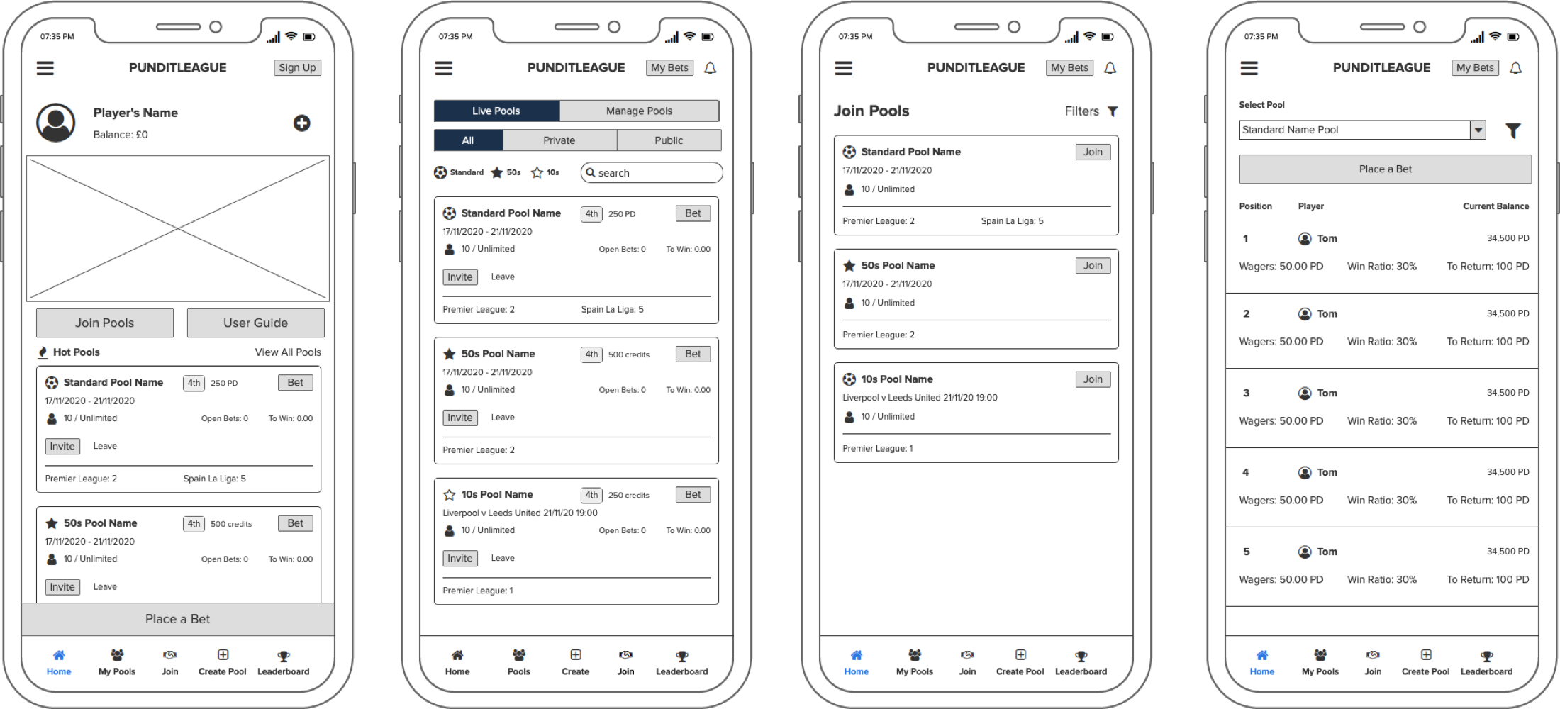
Wireframes & testing
There are 5 main sections within the app which is going work as the main navigation fixed at the bottom:
- Dashboard
- My Pools
- Join
- Create Pool (not presented in this case study)
- Leaderboard
Each menu item will work as a shortcut to complete the main user journey: join/create pools and place bets agains their friends, as well as checking their positioned on the leaderboard and invite friends.
Before signing up or start playing, the user can click on "Play Demo" on the homepage to go through a series of screens with tooltips to get the feeling of the app and the game itself. This was an idea I presented to the business as an outcome from testing the app on friends (screens to follow on a different section).
I won't go through the "Create Pool" section as that works as a mini app itself. Basically the user can create a pool by giving it a name, choosing matches and leagues and other settings, like making it private or public.
I believe push-up notifications as well as within the app are very important as this will encourage the user to get back to the app and place bets before a pool finishes. Other notifications include, winnings and new promotions.
Testing
Based on the wireframes, I conducted usability testing sessions to gather feedback, iterate on the designs, and improve the overall user experience.
Main Sections
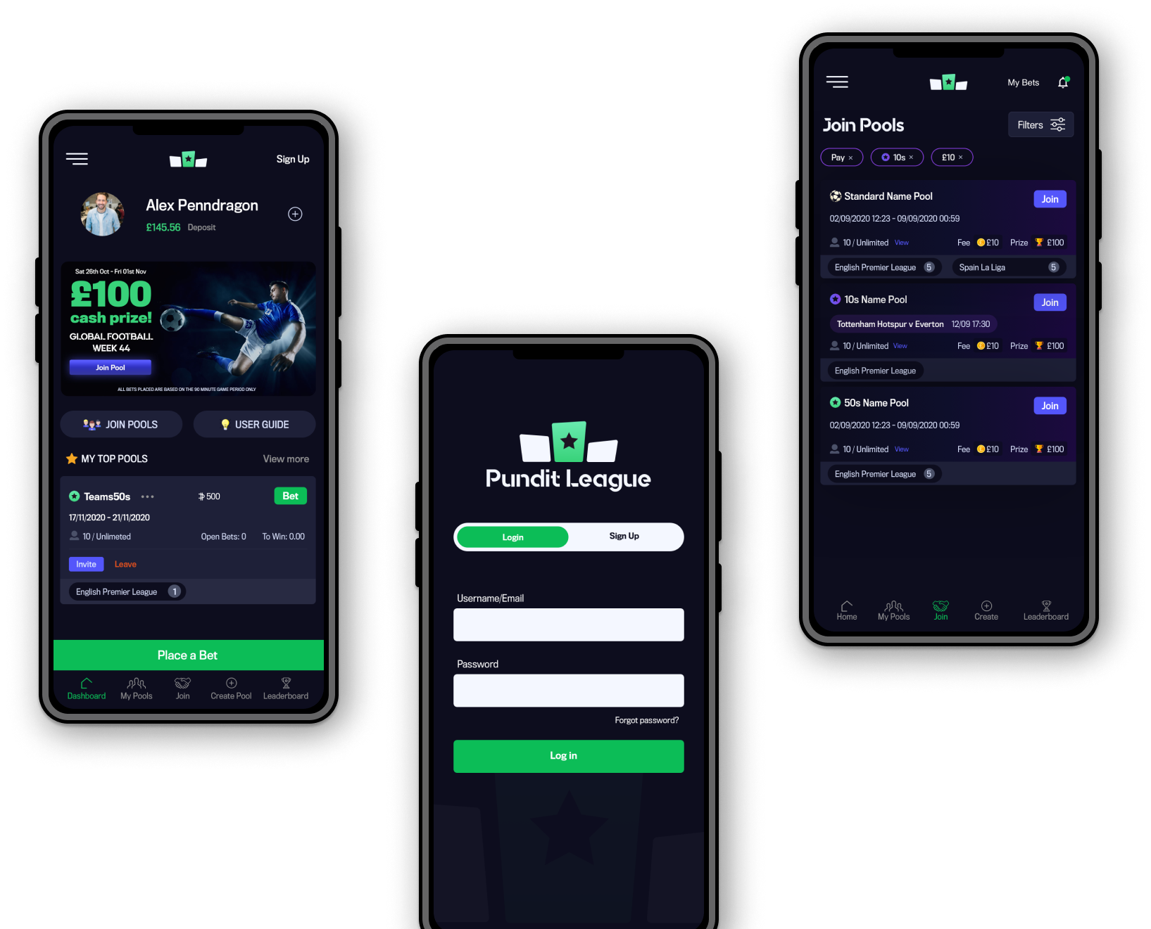
- Dashboard: the user will be able to see their information: win ratio, global ranking, wallet balance etc, pools and images with the main promotions. There is a fixed "Place a Bet" button at the bottom of the page. This button will open up a wizard for the user to be able to place a single bet in a single or multiple pools at he same time.
- My Pools: Putting together the cards, I realised that the business wanted to display a lot of information within a small space. As seen on the wireframe, every detail is well positioned, avoiding too many icons so the user doesn't get confused. I will make the BET button to stand out, as it is the main call-to-action. The user can toggle between pools that are currently live or he/she has created. I wanted to display the filters in this page instead of hiding it to make it different to the "Join" page.
- Join: Cards on this page are very similar to the "My Pools" cards. To make it different and cleaner to search pools, I decided to hide the filters which will be invoked once "Filters" is clicked on the top right of the screen.
- Leaderboard: Instead of having an individual pool page, I thought it was better to have a dropdown within the "Leaderboard" section. This way the user can toggle between pools quicker and click on "Place a Bet" if they decide to do so.
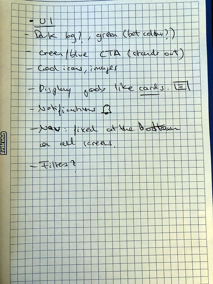
UI designs
The Log In and Sign Up page (as well as the logo) was a good exercise to get the initial look and feel of the brand.
To provide a seamless user experience, the design prioritized clear information organization, reduced distractions, and visually prominent buttons. This ensures users can easily find what they need and understand available actions.
"My Bets" (on the top right of the header) is usually an item within the main navigation, but as there isn't enough space it was a good idea to leave it at the top, mainly because this is the last step of the process and not within the main user journey. Like Notifications, this section will tell the user if he's won or lost a bet.
All the important information is displayed above the fold on all pages.
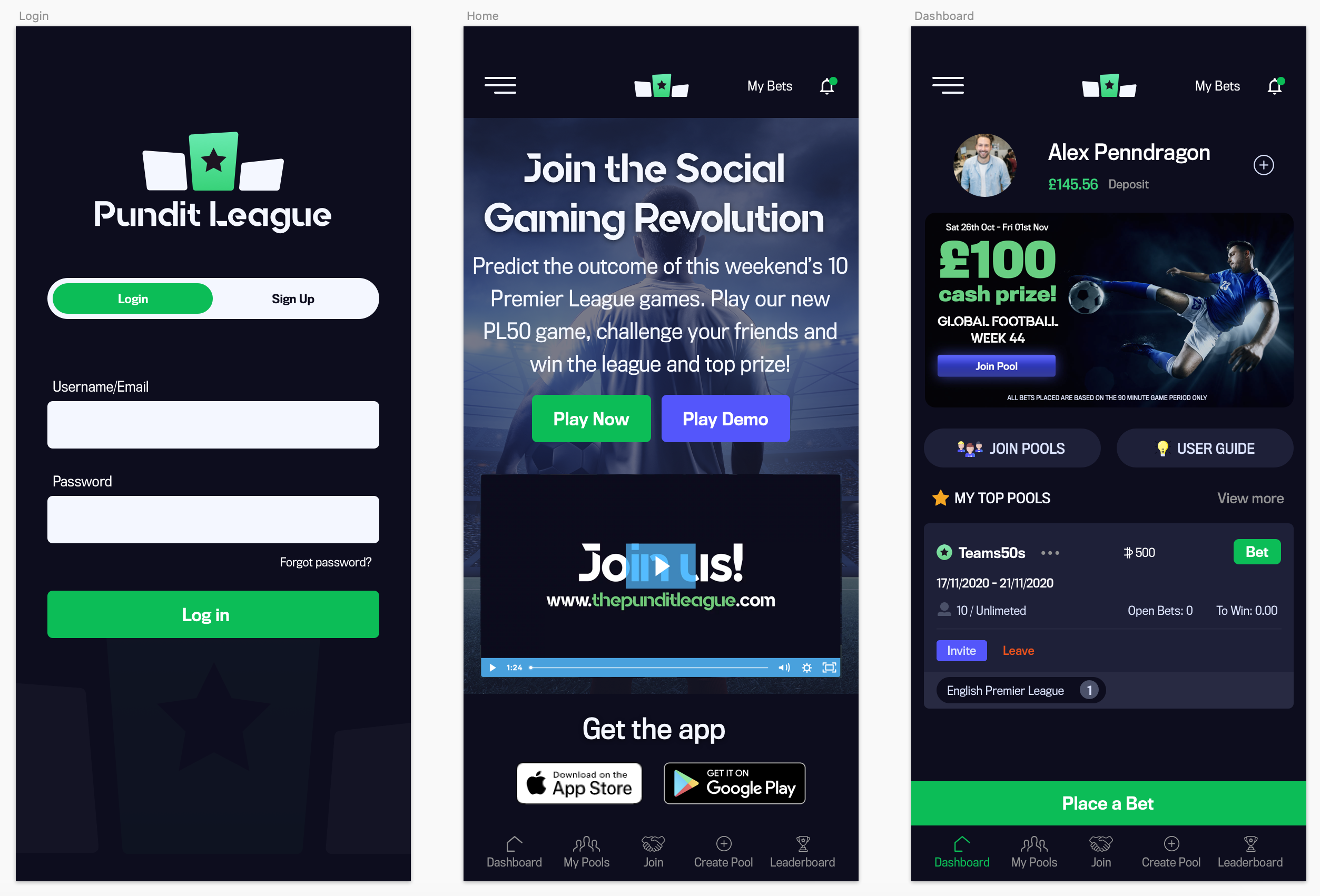
As I mentioned before, the Dashboard is the main screen. Here the user have a lot of options to take actions (apart from the main navigation): Check their global ranking and other stats (by clicking on the + sign at the top), click on the promotions displayed on a carousel, Join Pools, check the user guide, invite friends within the pools displayed and place bets.
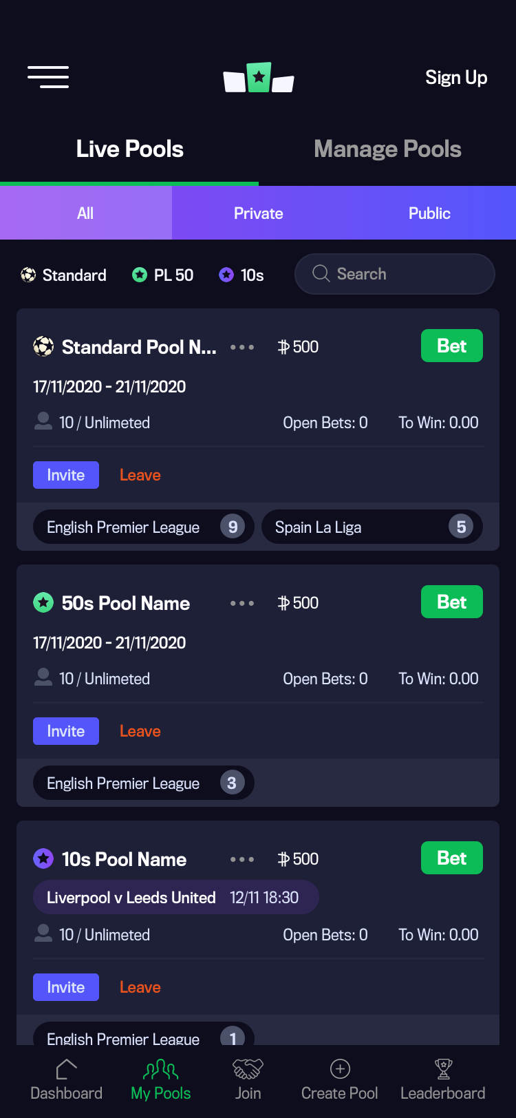
My Pools
I made three rows for the filters in a way that at least the first two pools are above the fold.
When a filter item is selected, the app will automatically refine the pools available by said selection, so the pools that the user want to see are shown straight away. The same method is applied when text is typed within the search box.
The main navigation is always fixed and visible at the bottom of the screen.
The leaderboard position and the available balance is shown next to the pool's name.
Users also have the option to invite friends as well as leaving the pool.
The bottom row of a card, shows the amount of games that are available within that league/competition.
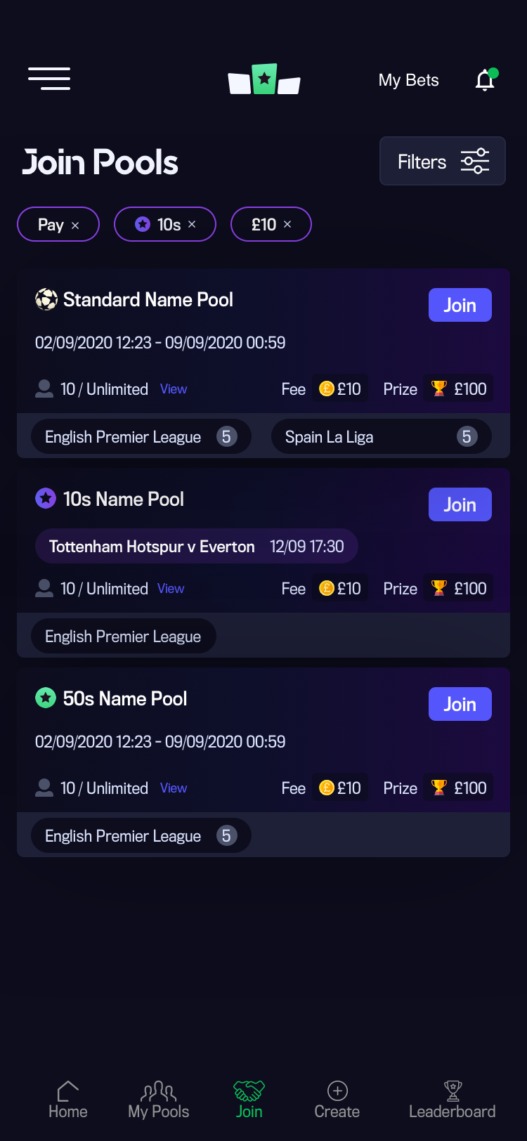
Join
For this section I decided to have a filters button option. When this is clicked, the filters will slide up from the bottom of the screen so the user can filter pools when the desired selection is applied, rather than changing the selection like on the "My Pools" page. The reason for this is that the user is not familiar with new pools like on the ones under "My Pools" page that he/she has already joined.
When one or more filters are applied, they will be displayed above the pools available. If you click on a filter selection, this will be removed and the page will automatically refresh.
By default, the join page will display all pools available by date.
The Join button is blue so the user knows that this colour is just for joining pools or inviting friends - to avoid confusion with the Bet button, like on the "My Pools" page.
Leaderboard
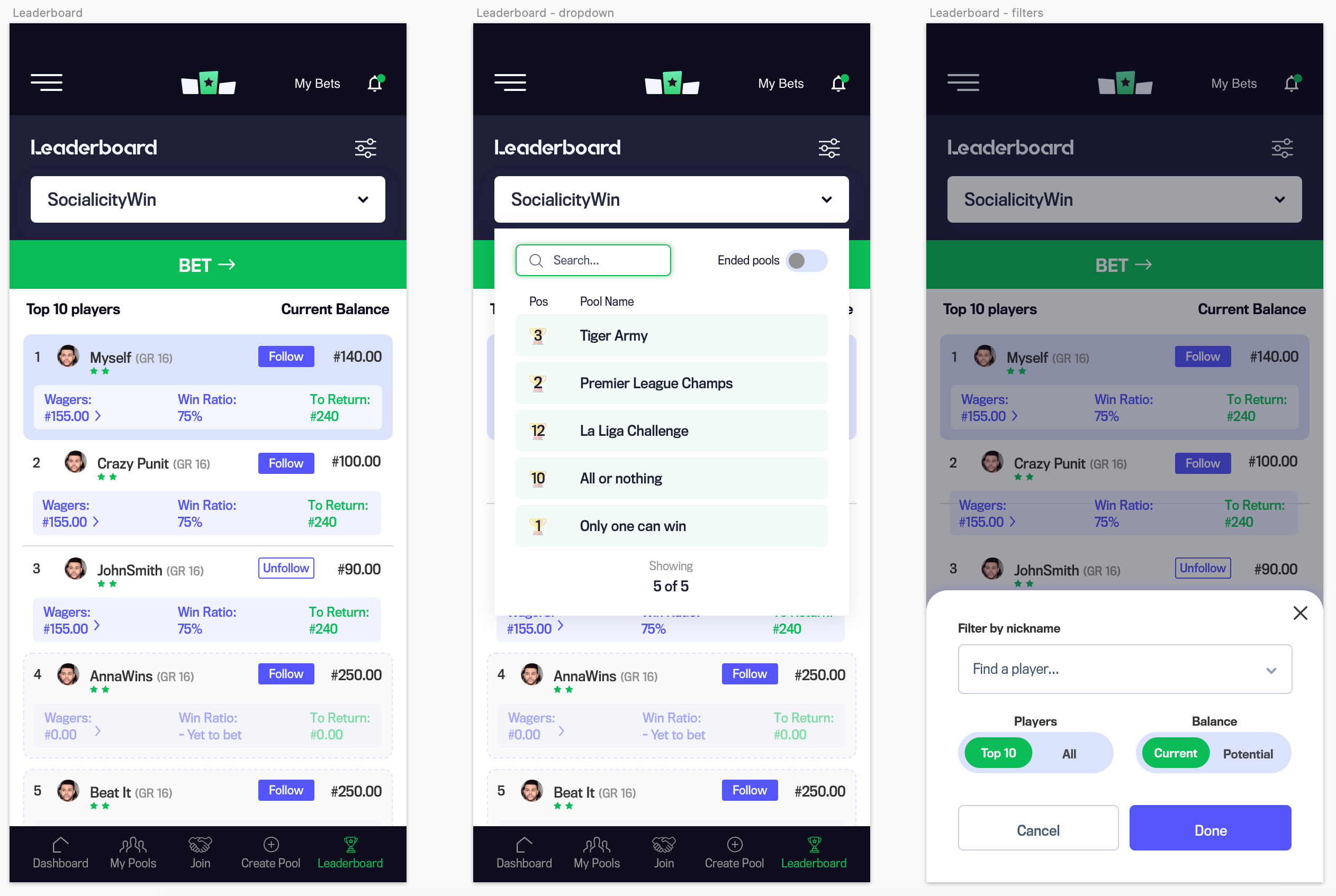
User feedback: To improve the overall user experience, it was suggested that a white background could make this section more visually distinct and easier to identify.
Here you have the main screen, dropdown selection and filters when clicked.
The user will see his/her name and stats under a light blue background.
When the user wants to see a leaderboard from another pool, a dropdown will show up showing all the live pools and the current position.
There's also an option to display pools that have already ended.
Testing to the rescue!
Demo/tour feature
I proposed a demo/tour feature after usability tests revealed challenges for new betting users. This feature encourages both new and existing users to try the game without an account.
As a result, we experienced a rise in sign-ups.
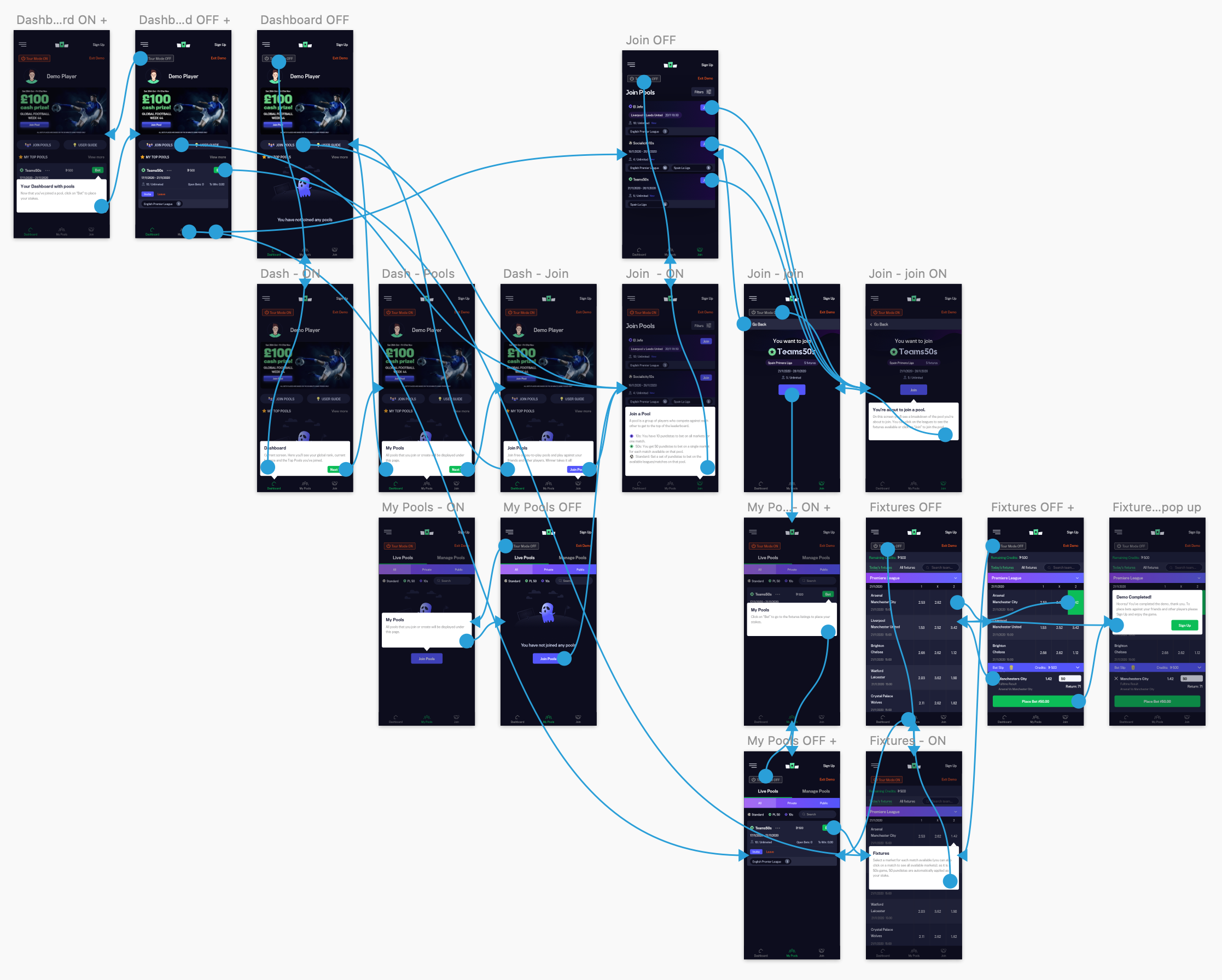
A series of tooltips are displayed as soon as the user enters a screen - to explain the main features for each screen and guide them. If you click "Skip" the tour mode will be deactivated; it can be re-activated by clicking on it again (to display the tooltips). If there's more than one tooltip, a "Next" button will be available to jump onto the next tip.
If the visitor/user goes back to a screen already visited, the tooltip won't be displayed unless the "Tour Mode" button - top left of the screen - is clicked.
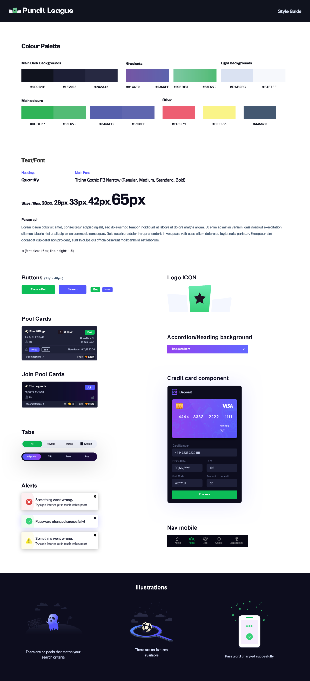
Styleguide
End result & conclusion
I led the design for the whole project and reported directly to the IT Director, Project Manager and CEO.
I worked closely with the development team in Malaga, Spain, to ensure that the screens precisely matched the final designs. Additionally, I provided expert advice on functionality and front-end code.
The app was launched and is available from the App Store and Google Play.