Campaign Hub
Campaign Hub is a platform that allows you to subscribe and quickly and easily create and manage ad campaigns (using the drag-and-drop software within the website admin panel), allowing you to promote your business on social media, email and/or SMS and generate leads that are delivered to you in real time.
View prototype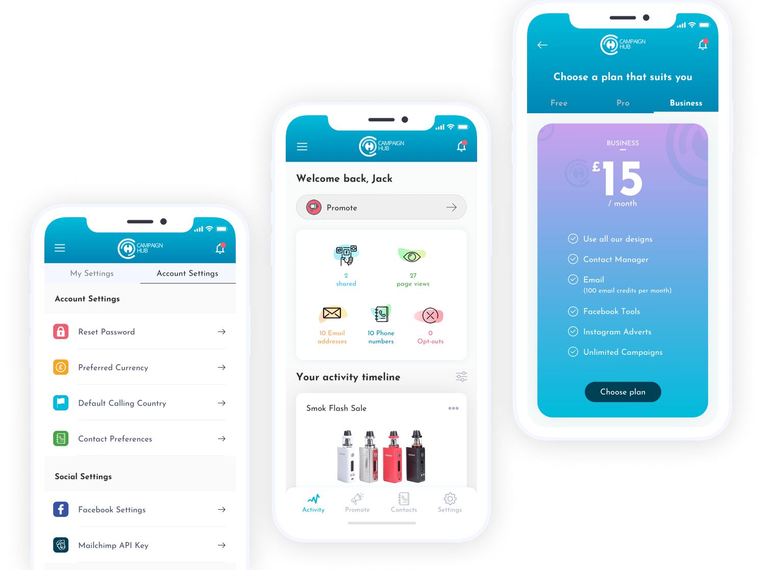
Role
User Research, UI design, Prototyping & Testing.
Tools


User Research
To understand the needs of our target market, we conducted focus group research with businesses seeking online promotion. Additionally, we conducted a competitive analysis and interviewed local businesses to gain insights into their specific requirements.
Findings - pain points:
- Use leaflets, which is a waste of money.
- Struggle to get new sign ups.
- Struggle to get new customers.
- Tried many different and expensive marketing systems to no avail.
Impact after using Campaign Hub:
- Easy to use and configure ads and campaigns.
- +50% in sign ups.
- 10 times more customers.
- "Best online marketing tool I have used so far".
- "Even people I don't know are sharing it and I’ve had loads of people download vouchers".
User Flow
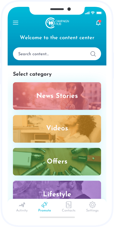
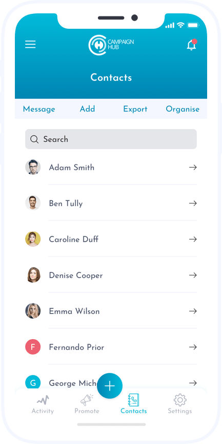
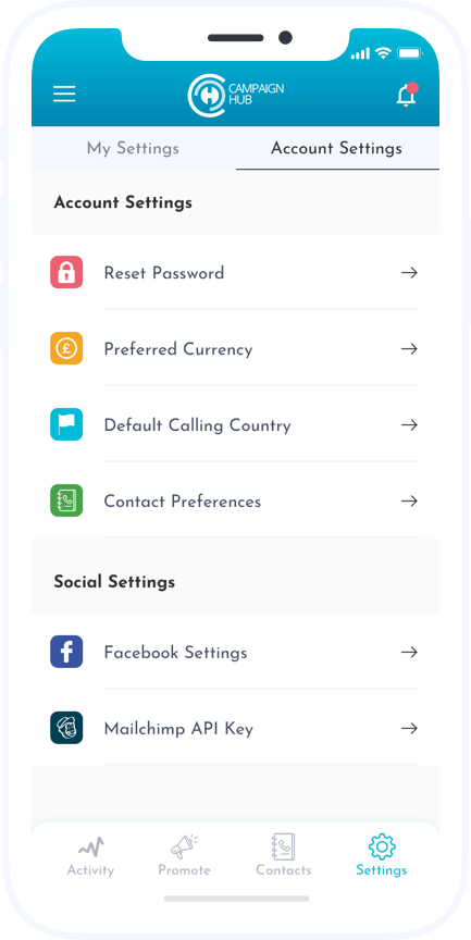
Once you access the app for the first time, the user will have to create an account or log in. Users can also examine how each offer and landing page is performing in an easy to understand system - here I'm trying to create the easiest/best user experience to achieve each task: whether it is promoting an offer, resetting the account's password, adding a new contact, etc.
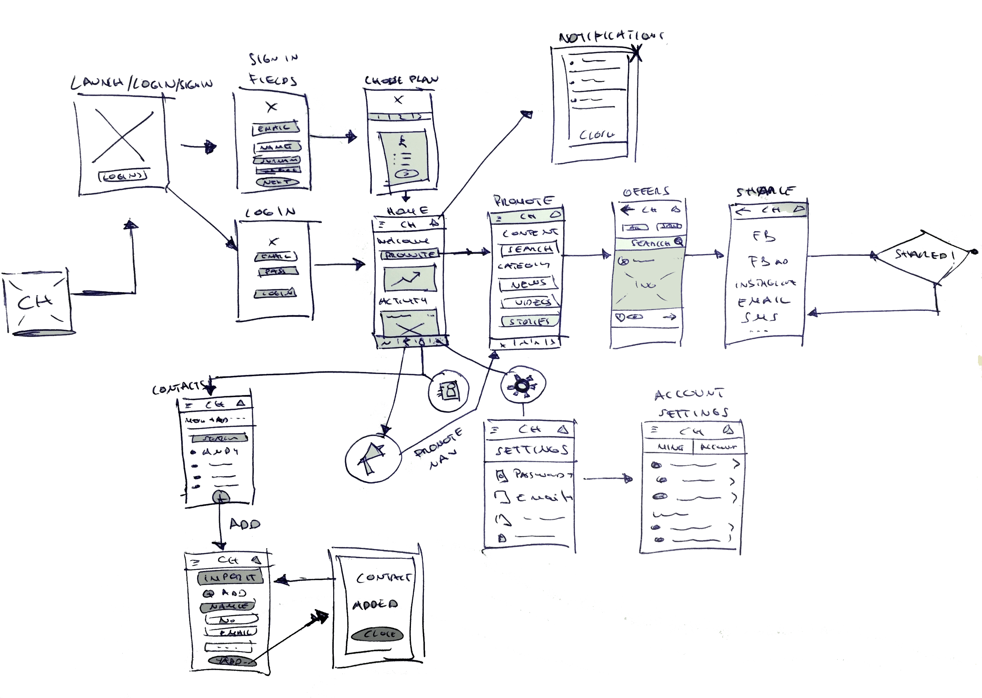
Wireframes and Testing
The low fidelity wireframes, made with Balsamiq, put everything into a better perspective. The main task here is: make it easier for the client to promote their offers.
I liase with other members of the team to throw ideas and make changes on the go - with pen and paper as well as on Balsamiq.
Thorough interviews and user testing we found out that the app must always revolve around the "PROMOTE" option, hence we added a 'Promote button' at the top of the dashboard/home screen as well as on the fixed bottom menu.
After conducting approximately 10 usability testing sessions, we noticed a positive response to the Facebook/Instagram integration. To facilitate a smooth user experience and encourage sharing, we designed similar features within the app.
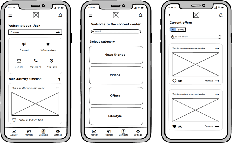
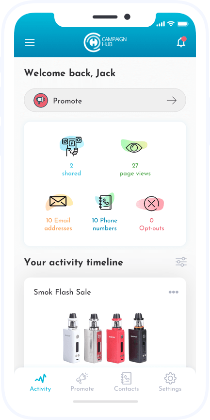
UI Designs
In order to walk the line between serious and friendly, I used a blend of light blue (friendly) and white (serious) with a mix of other friendly colours from the app screens. I also highlighted the product's simplicity, effectiveness, and ease of use through meaningful illustrations and iconography.
Since I started this app, I've liased with the Senior Developer and the companie's CEO to gather ideas together. As we started to explore the interface and visual design, we found at this point in the process to be the perfect time to grab a pen & paper again and make quick changes in Sketch in order to rapidly iterate on a wide variety of ideas. Because the central component of our app's experience is promoting offers from a feed, we wanted to push the boundaries of what a feed could look like, while remaining familiar enough that users wouldn’t be scared away. The business is very happy with this piece of work and it is now in the hands of the developer.
View prototype
Prototype
Created with inVision.
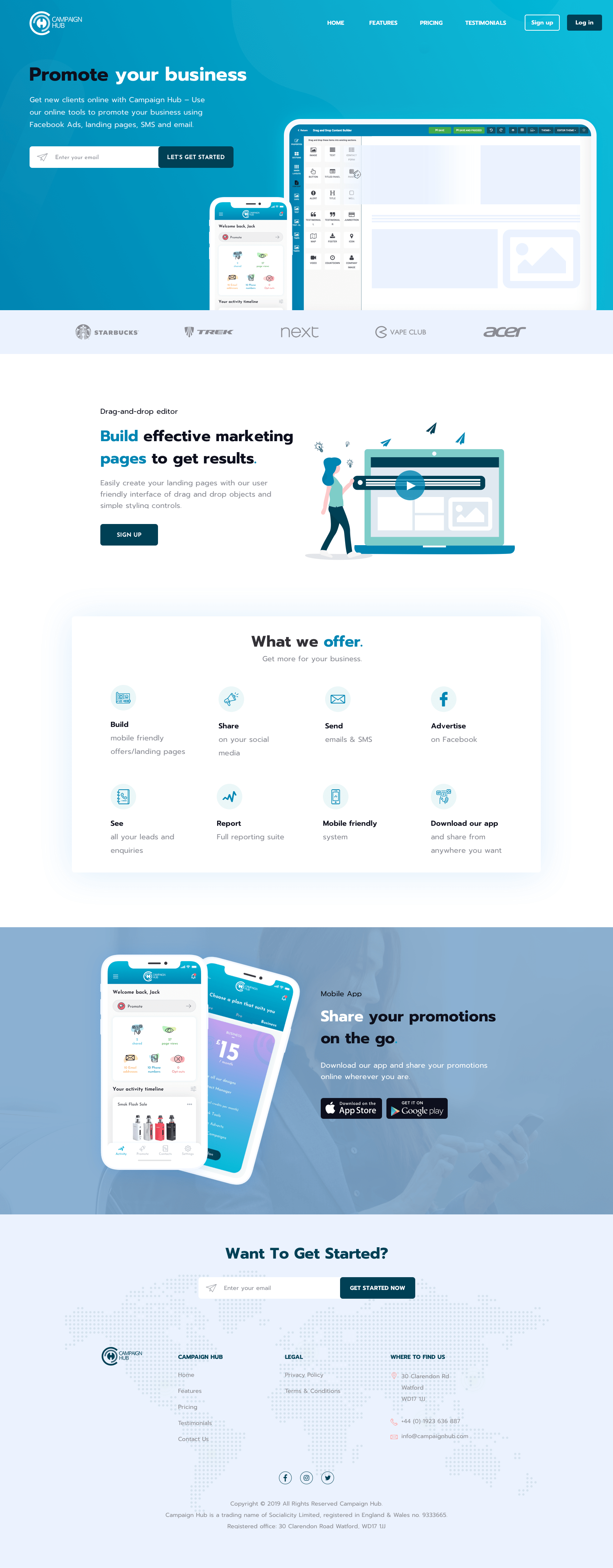
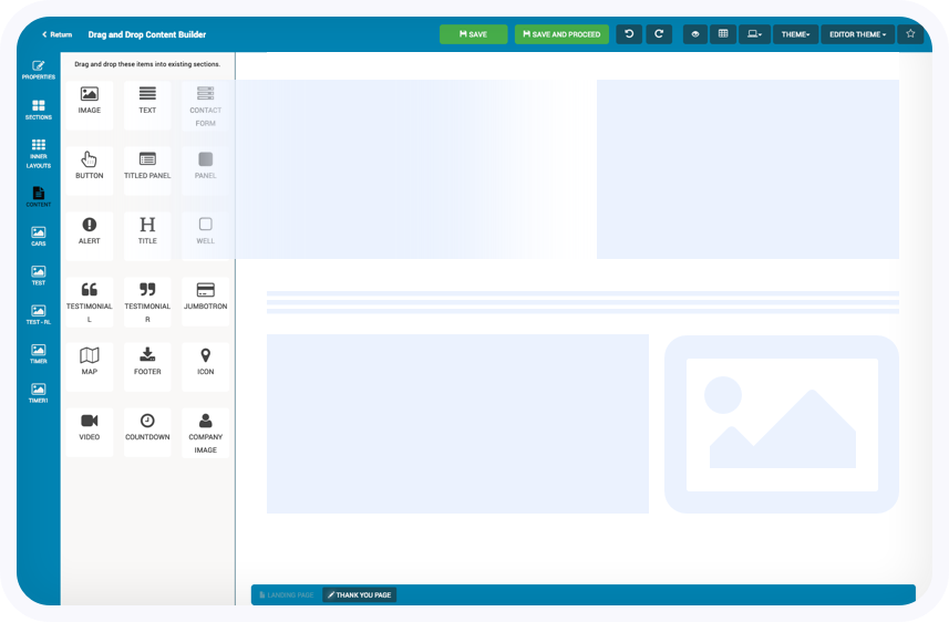
Drag and drop software
Users can create landing pages, with this simple drag-and-drop editor, which then can be shared/promoted via social media/email/SMS using the mobile app (as well as within the website).
I'm currently working at improving the user experience of this software tool. Users can use the left panel to navigate through tools which can then be dragged to create customized landing pages.
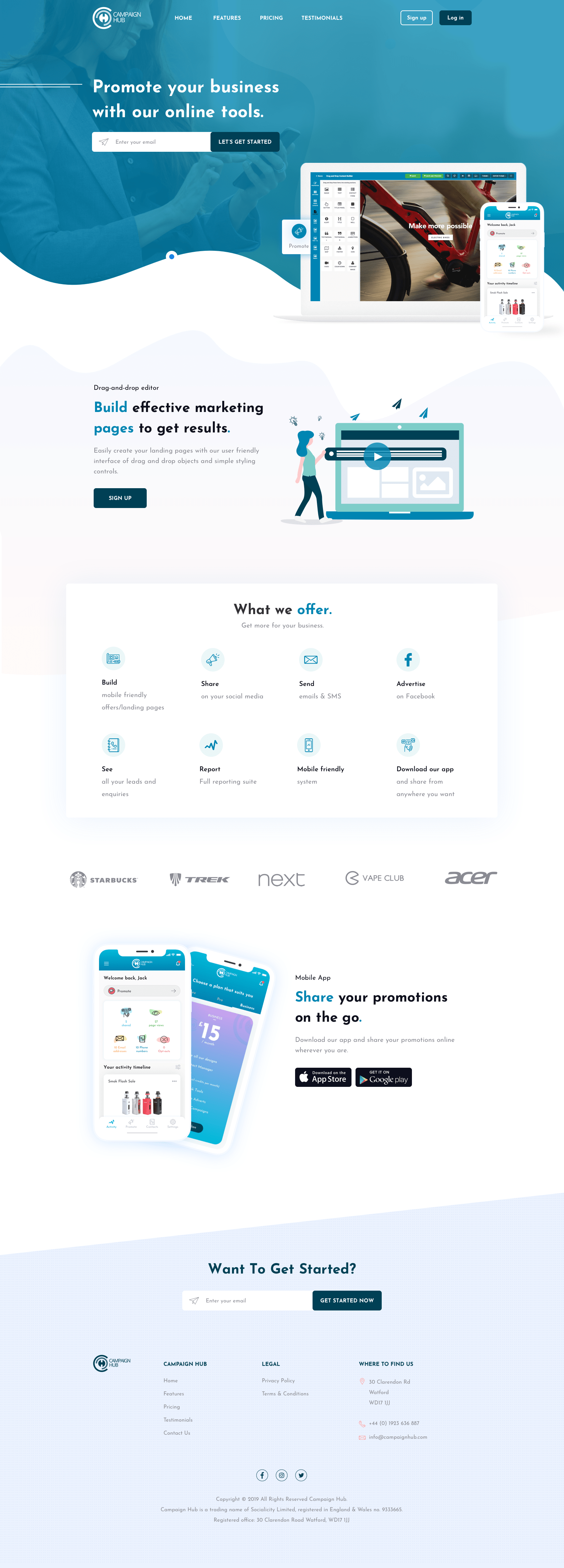
Web Design
Here are two examples I'm putting together for the new marketing site; here's the link to the current/old site: www.campaignhub.com.
Same as on the mobile app, I wanted to go with something friendly and serious at the same time. Big/bold headers with a change of colour on the key words, so the user can easily identify each section.
The designs below including the illustration were done in Sketch.